ON-THE-GO MEDICATION PRESCRIBING
Rcopia Mobile is a mobile accompaniment for DrFirst's flagship product, a web-based medication prescribing tool. The company wanted to develop its first mobile offering since the Palm Pilot, one that satisfied both standalone and integrated users' needs. I served as the Product Manager and Product Designer for the project.
Client: DrFirst, a Health IT company
Audience: Physicians and other healthcare providers
My Role: Product Management, UX research & early design
Duration: Nov - April 2015 (6 months)
Keep scrolling to see more details!
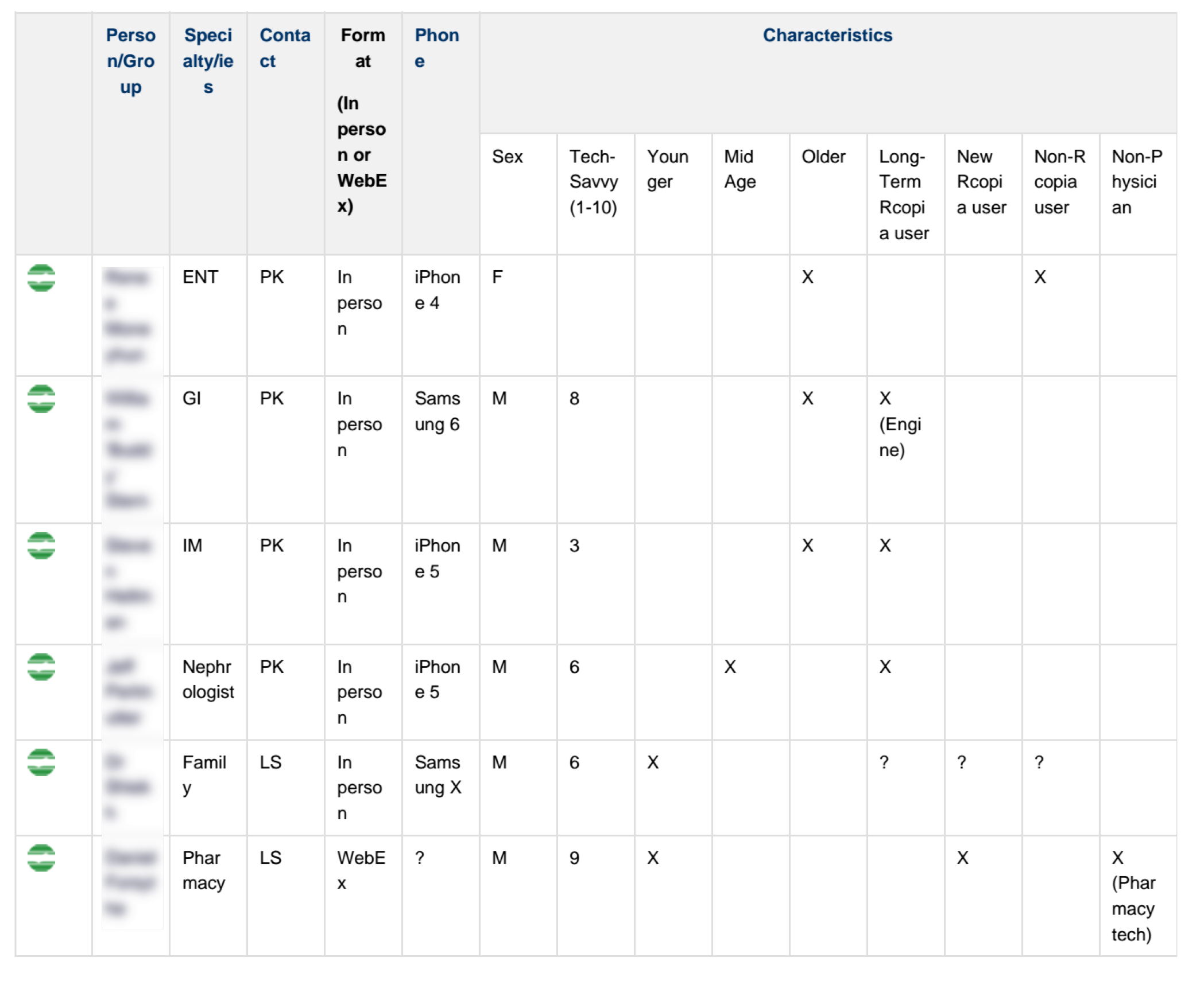
User Groups
Challenge
Doctors are increasingly mobile, and want to prescribe medications on-the-go. We found that many physicians spent time at home on their computers signing off on pending prescriptions and renewal requests after work each day or scrambled to find a computer when they were on-call. But, the prescribing process can be quite complex — which can make it especially difficult to do on a smaller screen.
Solution
Rcopia Mobile is a electronic prescribing app that allows healthcare providers to create and sign off on prescriptions with ease. It uses predictive analytics to display just the write drug and sig (prescription directions), with minimal typing, and displays clinical alerts in a highly scannable way.
We began by prioritizing the web portal's features.
We identified key use cases.
We gathered a representative from all the company departments, including Support, Implementation, Marketing and Sales. We identified 6 key workflows for mobile.
We surveyed Partners: what's important to you?
We surveyed Rcopia's biggest user base, their EMR Partners, to understand their needs for the solution.
I analyzed the competition.
I conducted a competitive analysis of existing mobile prescribing solutions to arm the Partners Sales team with information about their competitors, and to further determine feature prioritization.
I mined past log data.
I also looked at usage data from the web tool to justify each feature's inclusion in the first version, both to prioritize the entire feature and to inform the detailed feature design.
We came away with 3 main insights.
What was important to Doctors
Doctors were most concerned about speed, and the difficulty of typing accurate medication directions using a phone keyboard.
What was important to Partner EMRs
The Partner EMRs were on the same page with us in terms of use cases: supporting medication renewals and legend prescribing first and foremost.
What was important to the Company
We learned that private practice doctors were turning down our product in favor of e-prescribing companies that had mobile. The company also wanted to use this platform as a way to test newly developed features such as predictive sigs.
We designed the screens and detailed workflow.
We oriented using a workflow diagram.
I created a workflow diagram that detailed the prescription workflow to ensure that we would design all the necessary screens for the app and navigation for the workflow.
We conducted participatory design.
I worked very closely with the 2 physicians employed by DrFirst to create paper prototypes together; this was the first time at DrFirst that anyone had done low-fidelity prototyping like this, and it was very well-received.
We prototyped at several fidelities.
I created medium-fidelity Balsamiq mock-ups for both the v1.0 and v2.0 features, and then an interactive prototype using Proto.io. I showed these prototypes to many stakeholders from different departments within the company and iterated upon them based on their feedback. The detailed UI and final product were created by the front-end developer on the project.
We conducted user testing.
I worked with the on-staff physician to conduct 6 user testing sessions with local physicians of various medical specialties in their offices. I used video to review each sessions in-detail for usability issues with the Developer. I also created a ‘highlights video’ of participant-described use cases for the Marketing team.
We iterated based upon user testing results.
Example: Clinical Alerts
Original Screen: The web interface used red text for all warnings:
First iteration: In our first iteration of the mobile app, we designed clinical alerts that spanned 2 screens: a one-line alert within the prescribing process, and a full-screen explanation of the alert.
Post-user testing: From user testing, we learned that physicians wanted to quickly see the severity level of the clinical alert, and then, only if they considered it severe enough, they wanted to look at any detailed information. Our next iteration used color as an indication of severity, and collapsed the information so the clinical alert could be skimmed more easily.
The result: In our next round of user testing, these changes were validated by physicians' reactions. Physicians liked how scannable the new design was.
I worked closely with the Agile Development team.
I diagrammed data flows.
I worked with the Development team, especially the lead Architects, to create a data flow diagram. This assisted the Developers on the project, as well as helped the Partners Sales team explain the technical details to their customers. Diagram available upon request.
I detailed development requirements.
As the Agile Product Owner, I wrote detailed requirements for new features and worked with the Project Manager (Scrummaster) and 2 developers, using the Agile Development framework of scrums and sprints.
I worked with the Sales team to shape sales strategy.
In my role as Product Manager, I was tasked to help with the sales of this new mobile offering to DrFirst's Partner EMRs/EHRs.
We created a consultative sales diagram.
I created a consultative sales flow diagram to explain the available solutions based upon the customer's needs/wants. The Partner Sales team were better able to understand and describe the customer-centric technical integration possibilities. Diagram available upon request.
We publicized this new product at a tradeshow.
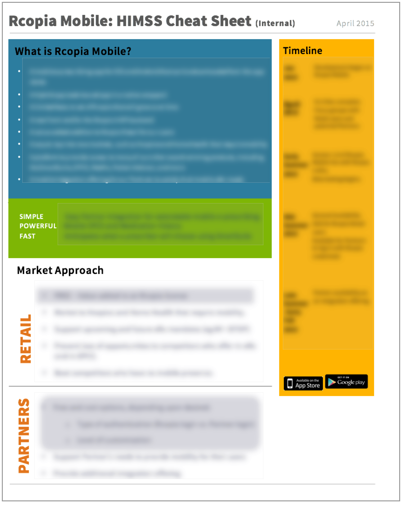
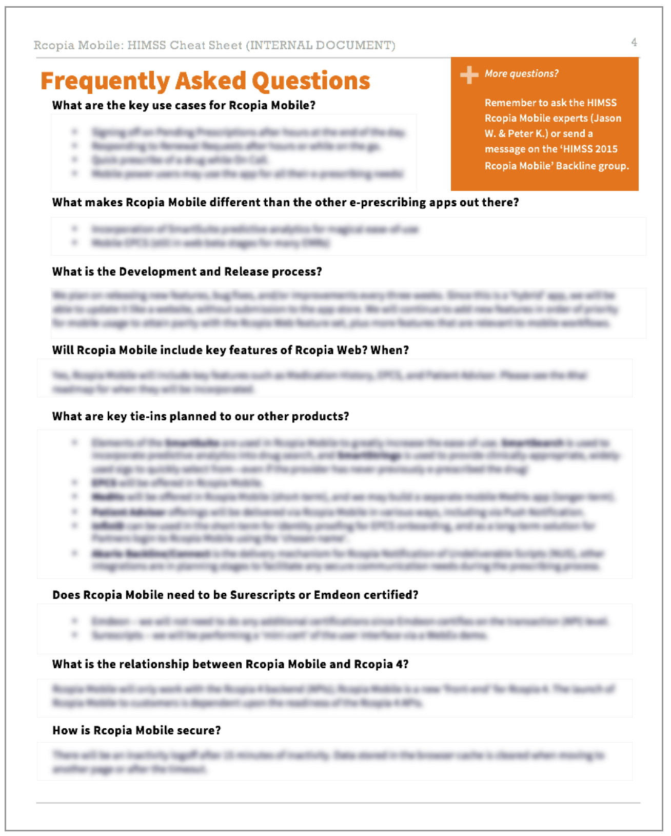
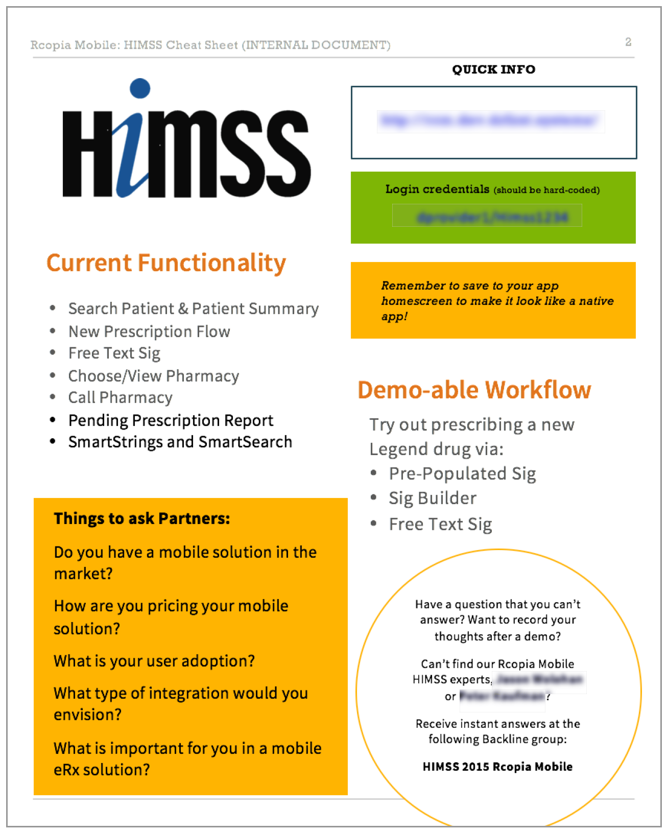
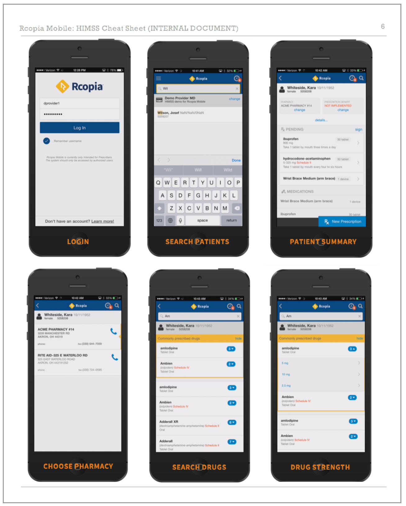
We pushed to get the first version demo available in time for an important tradeshow for the company, Health Information and Management Systems Society (HIMSS). To ensure all the attendees from Executive, Marketing, Product Management, and Sales teams were able to talk up this new product offering, I created this 'Cheat Sheet' packet with key information and FAQs on Rcopia Mobile.
“Great feedback from [specific EMR company] — they were very impressed, ‘blown away’. ”
FINAL DESIGNS
PATIENT SUMMARY
After searching for a patient by name or DOB, the patient summary screen highlights the key actionable information a physician would want to see about a patient, with the option to drill down further if needed. A persistent 'New Prescription' button begins the prescribing process.
SIG BUILDER
After iterating through many ideas for a replacement for all the Sig (prescription directions) drop-downs in the web tool, we came up with our test users' favorite feature: the Sig Builder. Physicians can quickly zoom through the selection process, and add additional custom directions (e.g., for tapered medications) if needed.
SMART SEARCH
Typing in a drug name can be cumbersome and error-prone, so we used a new in-house predictive analytics suite to show the most commonly prescribed drugs at the top while searching. We transformed the dosage drop-down into a collapsible menu that highlights how many dosage options are available.
CLINICAL ALERTS
Clinical alerts were a first version must-have for both clinical safety and product certification, but many physicians find it frustrating when they're told information they already know. We created a color-coding scheme and visual design that highlighted the severity of the alert first, so physicians could choose when to pay further attention to them.
LESSONS LEARNED
Lesson #1: With a lot of hard work, you can bring UX techniques to a UX-free company.
There were no non-consultant UX professionals at DrFirst while I was working there; I started reading UX books after thinking that there must be a better way to design software, a way that would ensure users would like what we developed. I asked my company to sponsor the part-time course in User Experience Design at General Assembly DC for me. When I began this project, I decided that I would implement the techniques I had learned about. I spent a week paper prototyping with the company's on-staff doctors, and conducted user testing sessions. And it turned out, people really enjoyed it! The on-staff doctors in particular told me that they had never felt that their opinions were really heard before.
In every presentation I gave on the product, I used this slide to show the iterative process we'd gone through:
“I was really impressed with the results of your Rcopia Mobile project and want to see if we can capture some of that magic with the new project.”
Lesson #2: Continually show your design to Support and Implementation.
I showed the design at all stages (low, medium, and hi-fidelity) to many employees of the company. I found in particular that the Support and Implementation teams, who work directly with customers day in and day out, were the most likely to hone in on parts of the design that would cause issues. Their feedback was invaluable to the project.


